
Improving product discovery and navigation clarity through research-driven iteration.
Elitefizzy UX Redesign
Improving product discovery and navigation clarity through research-driven iteration.
Role: UX Researcher, Product Designer & WordPress Designer
Duration: Jan 2026 – Mar 2026
Tools: Figma, WordPress, WooCommerce Analytics
Improved product discovery and navigation clarity through research-driven iteration.
Project Overview
Elitefizzy is an online gadget store selling smartphones, tablets, and laptops. After launching the website, traffic steadily increased but the platform struggled to convert visitors into orders.
Since I was both the WordPress designer who built the original website and the product designer responsible for improving the user experience, I initiated a UX investigation to understand why users were visiting but not easily discovering products.
The goal of this project was to redesign the homepage navigation and product browsing system to make product discovery faster and more intuitive for users.
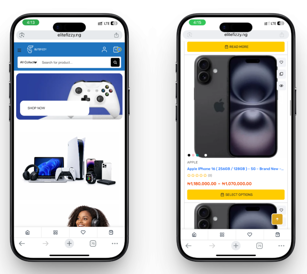
BEFORE
Problem Statement
Although the website was receiving traffic, users were not efficiently finding products through browsing.
Through observation and early testing, I discovered several usability issues:
• Product categories were not easily visible
• Users depended heavily on the search bar
• Category navigation did not attract attention
• Product discovery required too much scrolling
Because of this, users struggled to quickly identify where products were located.
Goal
The goal of this redesign was to improve how users discover products by making category navigation clearer and easier to interact with.
The redesign aimed to:
• Increase category visibility
• Reduce reliance on search
• Improve product discovery speed
• Make navigation easier for mobile users
Design Process
The project followed a simple UX process:
Identify the problem
Observe user behaviour
Design a solution
Test with users
Iterate based on feedback
Validate the final design
This iterative process allowed the design to evolve based on real user behaviour rather than assumptions.
I Conducted Usability Testing after the first Redesign
To understand how users interacted with the website, I conducted an early usability test with two users.
Task
Users were asked to play around the homepage.
Observations
Both users immediately scrolled down the page instead of using the category navigation.
Later, one of the users scrolled back up and noticed the category navigation but initially ignored it.
Insight
The horizontal category navigation was not visually strong enough to attract user attention.
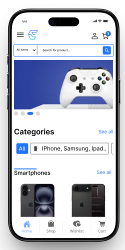
Horizontal Categories layout
First Redesign
First Design Iteration
After identifying that the horizontal navigation was not immediately visible, I explored a new navigation structure.
Changes introduced
• Converted the horizontal category layout into a vertical structure
• Placed the categories directly below the hero section
• Limited the categories to four main options
• Used auto-layout sizing to create a clear visual hierarchy
The top category (Smartphone) was intentionally made larger to emphasize its importance since smartphones represent the most common product type.
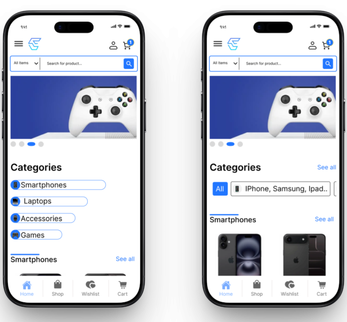
First Iteration | Vertical Categories layout – Without Padding around the buttons
AFTER
BEFORE
Public Validation (Online Survey)
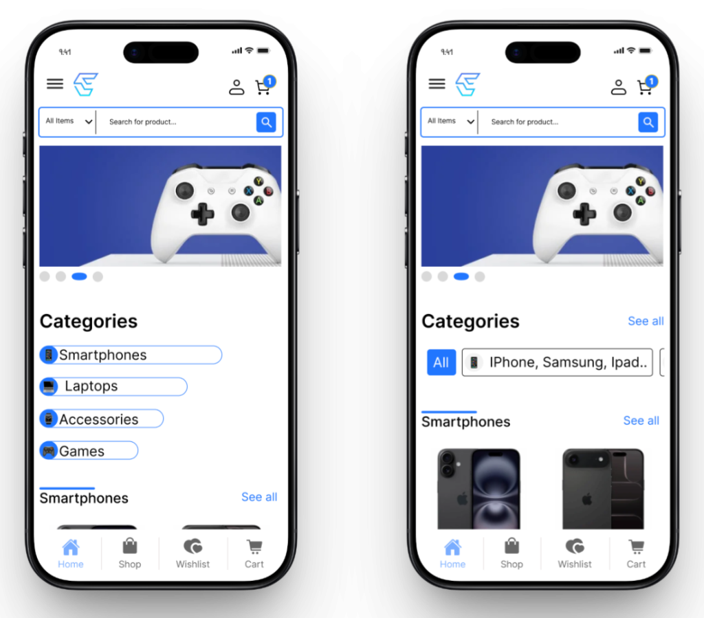
To validate which layout users preferred, I conducted a public feedback test online.
Two designs were presented:
Design A – Vertical categories
Design B – Horizontal categories
Participants were asked which navigation system felt clearer and easier to interact with.
Feedback results
Some users preferred Design A because it was easier to see the categories.
Others preferred Design B because the categories had padding and spacing which made them feel more comfortable to interact with.
One user commented:
“Add padding to the categories.”
This feedback showed that the vertical structure worked but needed spacing improvements.
VERTICAL
HORIZONTAL
Second Design Iteration
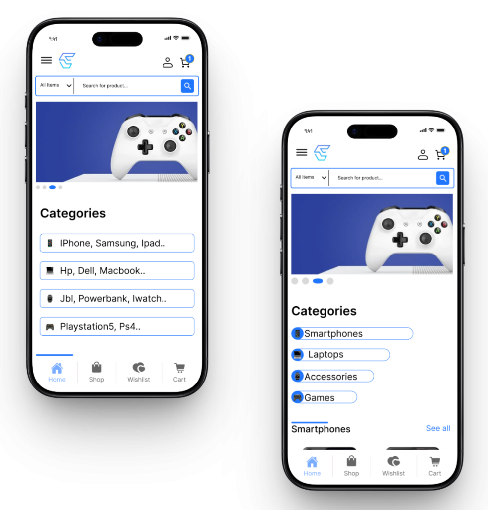
Based on the feedback, I refined the vertical layout.
Improvements made
• Added padding around category buttons
• Improved spacing between categories
• Simplified category naming
• Introduced product-specific labels
Instead of generic labels like:
Smartphones
Laptops
I changed the categories to more specific examples such as:
“iPhone, Samsung, iPad, MacBook”
This allowed users to immediately understand what type of products were inside each category.
To indicate that additional products existed inside the category, I added ellipsis (…) after the labels.
Example:
MacBook, HP, Dell…
This helped communicate that more options were available.
Second Iteration | Vertical Categories – with simplified category naming and padding around the buttons
AFTER
BEFORE
Product Listing Improvements
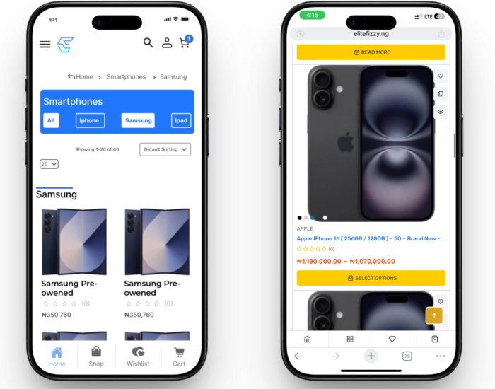
The product listing page was also improved to make filtering easier.
Changes made
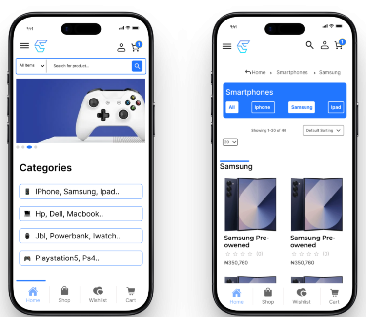
• Applied brand blue background to filter navigation
• Active button state changed to white background
• Inactive buttons displayed white stroke
• Added manual tap filtering directly from the navigation bar
These changes improved filter visibility and made browsing smoother.
Product listing page redesigned from 1 column grid to 2 column grid and it was improved to make filtering easier
AFTER
BEFORE
Final Testing
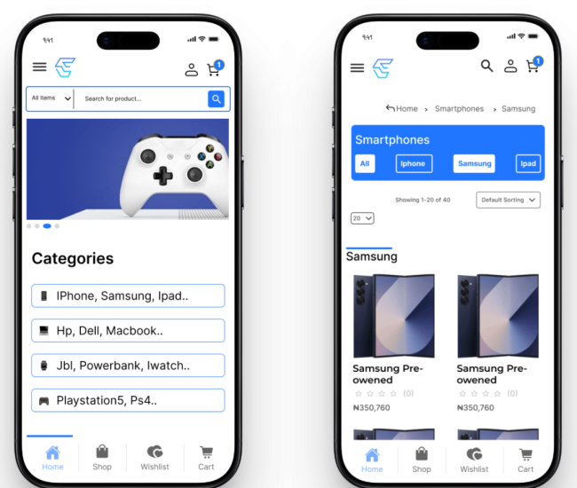
After implementing the refined design, I conducted another usability test with three users.
Results
All three users interacted with the category buttons immediately.
Instead of using search, they selected categories directly to browse products.
This showed that the redesigned navigation successfully improved product discoverability.
FINAL DESIGN
Results
The final redesign improved the browsing experience by making categories clearer and easier to interact with.
Key improvements:
• Categories became immediately visible
• Users clicked categories instead of relying on search
• Product discovery became faster
• Navigation became clearer for mobile users
The redesign successfully addressed the original usability problem.
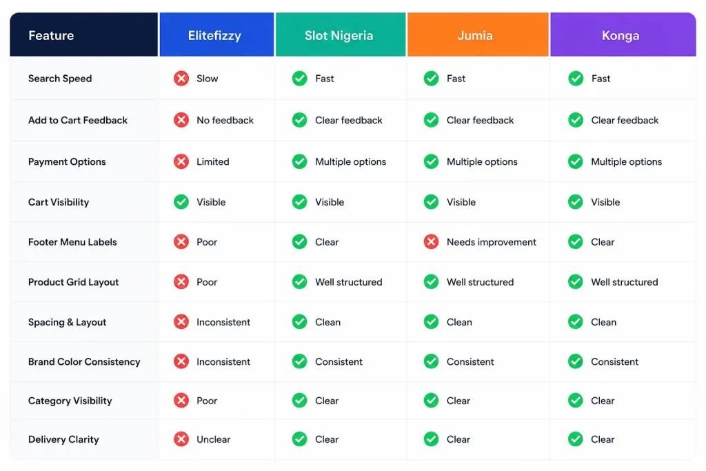
Competitive Analysis
Evaluating leading gadget e-commerce platforms to identify usability gaps, benchmark industry standards, and uncover opportunities to improve product discoverability, navigation, and mobile conversion for Elitefizzy.
Development Status
Due to the limitations of the purchased premium WordPress theme and the absence of Elementor Pro premium builder, the full Figma UI redesign could not be implemented exactly as designed.
Instead, I focused on applying the most important UX improvements using the available theme structure. Product categories were moved directly below the hero banner to improve visibility and reduce search dependency. Although the final layout was adapted into a horizontally scrollable structure instead of the planned vertical layout, users could now easily find categories and navigate directly to products.
Testing confirmed that the redesign worked successfully users interacted faster, browsed more easily, and product discoverability improved significantly.
While the full visual refinement will be completed in a future phase, the current implementation already delivers the main goal: better usability and stronger conversion potential.
Reflection
This project highlights the importance of iterative design and user-driven decision making.
Instead of assuming a solution, the design evolved through observation, usability testing, public feedback, and refinement.
By continuously validating ideas with users, the final design successfully improved how users interact with the product discovery system.